More pretty graphs…
November 12, 2013 - 1:26 am by Joss Whittle Matlab PhD UniversitySo I’m still playing with graphs in Matlab… I shouldn’t complain, I know. I should be cherishing how laid back and relaxed the PhD experience is right now compared the where I’ll be a couple of years from now.
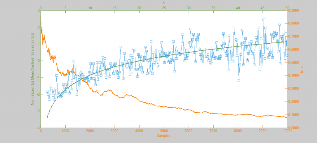
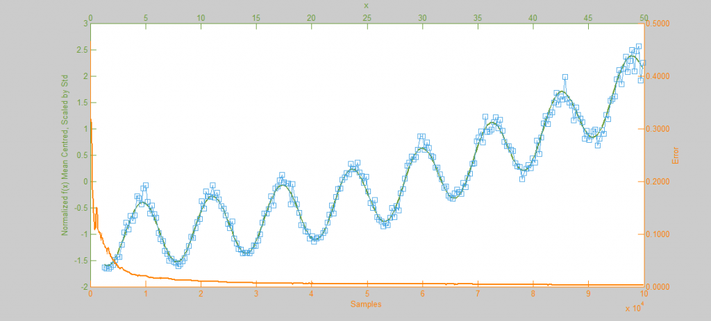
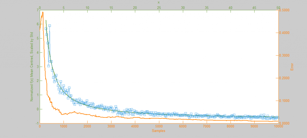
The function f(x) is shown in green, the sample distribution in blue with histogram bins marked as circles, and the error curve in orange. Since creating these images I’ve begun drawing the error on the log x log scale which displays as a linear decay as you’d expect.